9 reasons why we’re doubling down on Material Design for our enterprise web apps
I’m a pragmatist, I ♥︎ productivity and I believe in being really agile (not some imposed system to foster agility, but that’s another post).
What makes material design so special?
(Hint: It’s not the bright pink floating action button)

- It’s a design spec married to code implementation
Unlike frameworks like Bootstrap or Foundation which both are largely and intentionally lacking themes, Material Design comes with both (since it’s both spec + frameworks).

2. Official implementations from the horse’s mouth (Google)
This is a huge reason we chose Material; it turns out Google knows a thing or two about the web and they have more designers & devs than your company. Beyond their knowledge & resources, Material has ensured worldwide adoption since…Google.
- Polymer — focused on native web components with “Paper” material elements
- Angular-Material — AngularJS modules, directives & services
(we’re using Angular-Material, here’s why) - Material Design Lite — Lightweight implementation of material intended for websites & landing pages
There’s also a plethora of great non-official implementations like Bootstrap Material, Material-UI (react), Ember-Paper, LumX (angular), Materialize, MUI and many more…

Oh, you have your own grid or framework?
That’s cute. How big is your team that’s maintaining your framework instead of building your product?
It takes a lot of resources and confidence (or ignorance) to think you can build, maintain, and more importantly test a homegrown web application framework. I’d rather use one that the planet is hardening for me while I sleep.
3. The spec keeps growing & iterating for you w/o your time
As you’re focused on developing your app, Google is going to keep extended and enhancing the spec. I specifically remember thinking: I need data tables though…oh they added them. Man we really need a wizard or steps…oh neat that’s there now too!
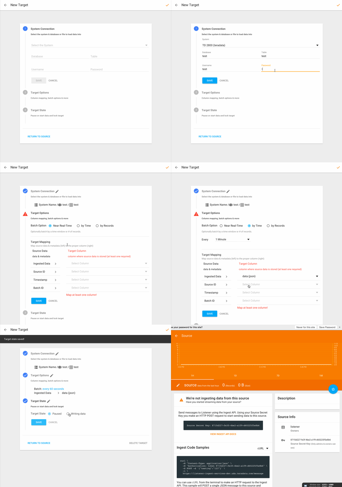
Btw, the Stepper was a case where we extended Angular-Material since they haven’t had the chance to implement them yet, here’s what we were able dev quickly since we had a spec to go from:
4. So many devices & breakpoints have been considered
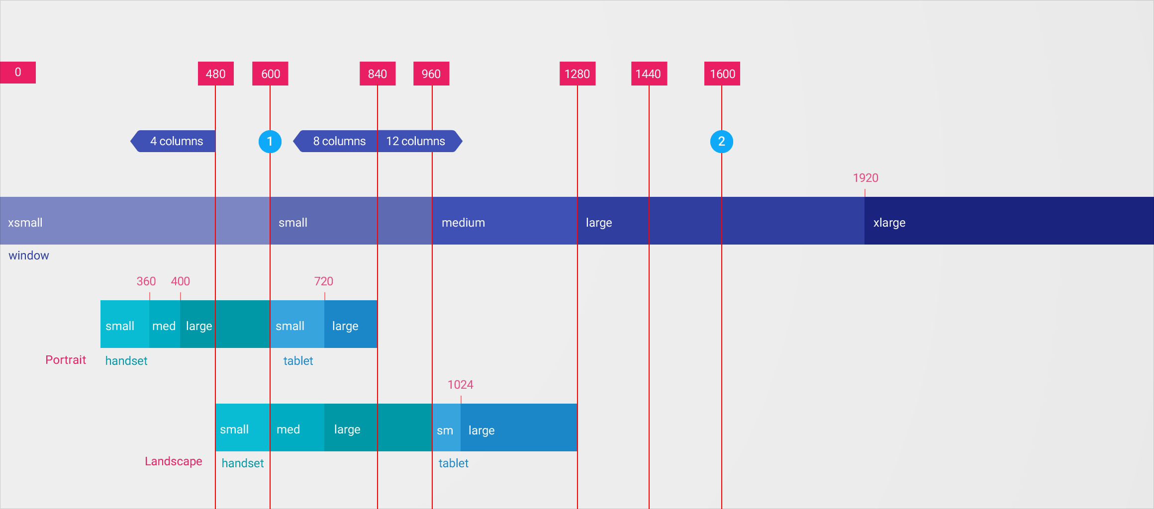
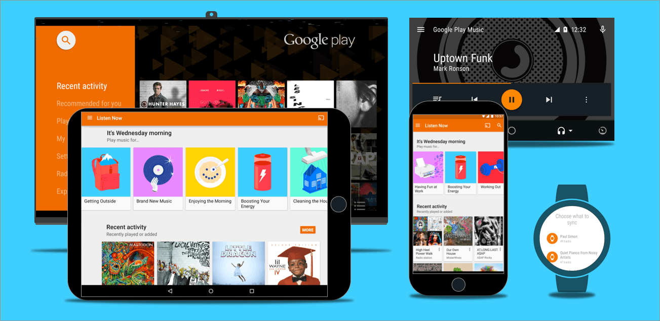
Everything from watch to phone to tablet to desktop to car to tv have been considered, and all provided for you and tested by the world
All the breakpoints considered in the Material Design spec:
5. Familiarity for Users, Designers & Developers
Users will already know UI design patterns from android tablets, phones, Google websites, Google iOS apps and other apps built on Material Design when they come to your app.
When attracting and hiring new talent, designers and developers will already be familiar with your design spec & code standards. They might even take the job because you use Material Design.
You might ask: Won’t my app look like everyone else?
To which I’d reply: Are iOS, Android, Windows and OSX native apps not unique?

Your features, UX and support make you unique, which you can build since you’re not spending all your time designing a spec and developing a framework.
Basically it’s Human Interface Guidelines for the web (finally)
6. Focused on Accessibility
Google has invested a ton into making all these implementations extremely accessible. Polymer & Angular-Material boast extremely impressive support for screen readers, keyboard interactions, reachable controls, operable controls, ARIA (roles, states & properties), text alternatives, semantics & more.
It also turns out that the bold, high contract color palette performs well in color blind tests:

7. Design & Code are open sourced for you
Obviously the code implementations are open source, but with Material Design you also get a complete design spec. Adopting open source design seems hard for some designers to get, but devs have been living this way for years.
Our team would never build software for containers when we can just use Docker. We’d never build whatever the hell Mesos does (it turns a data center into a single pool of resources). Why not think of a design spec the same way? It’s one less think to build that enables our speed to productivity with a small team.
Your team is developing features while others are designing a spec and developing a framework, now that’s agile. By using standardized, reusable design patterns and web components, we’re free to rapidly generate prototypes.

8. It’s anti-waterfall design
Instead of waiting for a waterfall process of wireframes, flat design mockups, feedback loops, etc, you can immediately create interactive prototypes.
Devs can (and should) own UX too, not just designers. With an established design spec + web framework, engineers have instructions (they like those) on how to implement UI.
Also, designers can’t design wacky stuff that developers can never create. They’re protected against themselves.
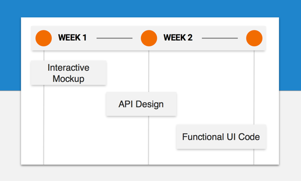
In our team we can design an interactive prototype, iterate, get approval, and implement into functional code all within one 2-week sprint.
9. Inspiration, Community & Resources Oh My
With the adoption rate of Material Design you also get the tidal wave of resources that come along with it.
If you’re needing inspiration beyond the official spec, you have MaterialUp and Material Design Blog. Those same sites also offer tons of great free resources, templates, snippets and tutorials. Dribbble is less focused on material, but obviously has a ton of goodies.
Beyond designing a spec for icons, Google has open sourced over 700+ official icons in various formats (including icon font, svg and more).
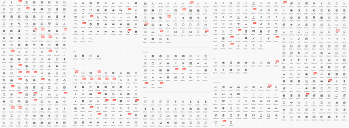
I’ve even gone through the trouble of converting those to native Powerpoint & Keynote editable shapes (and some other stuff) for you.
Like color tools? There’s several material design color palettes & pickers out there.

Looking for community? There’s a Material Design Slack chat with over 2500+ other material enthusiasts. Beyond chat there’s also meetups and conferences popping up all over.

These are all the things you get for embracing such a widely adopted tool. You get a worldwide community that has your back.
